Last fall I taught an introduction to Bayesian statistics at Olin College. My students worked on some excellent projects, and I invited them to write up their results as guest articles for this blog. Just in time for Valentine's Day, here's the second in the series:
It’s (Not) a Match!
Ankur Das and Mason del Rosario
Valentine’s day is fast approaching, and if you are anything like us engineering students, you will most likely be dateless on the 14th of February. Luckily, there are lots of great apps geared towards bringing singles together. One of the most popular is Tinder. For those unfamiliar with the app, Tinder presents the user with other users’ profiles, and the user then either swipes right for yes or left for no. When two people have swiped right on one another, they become a “match” and can chat with each other via text through the app.
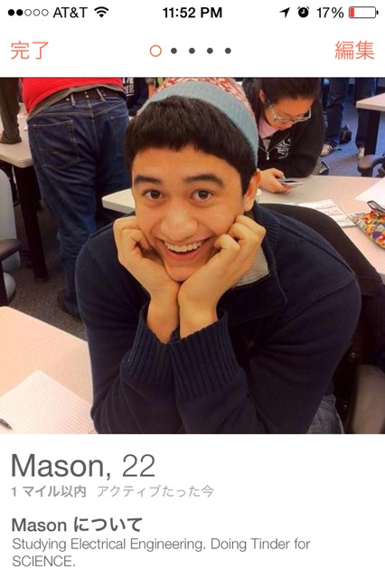
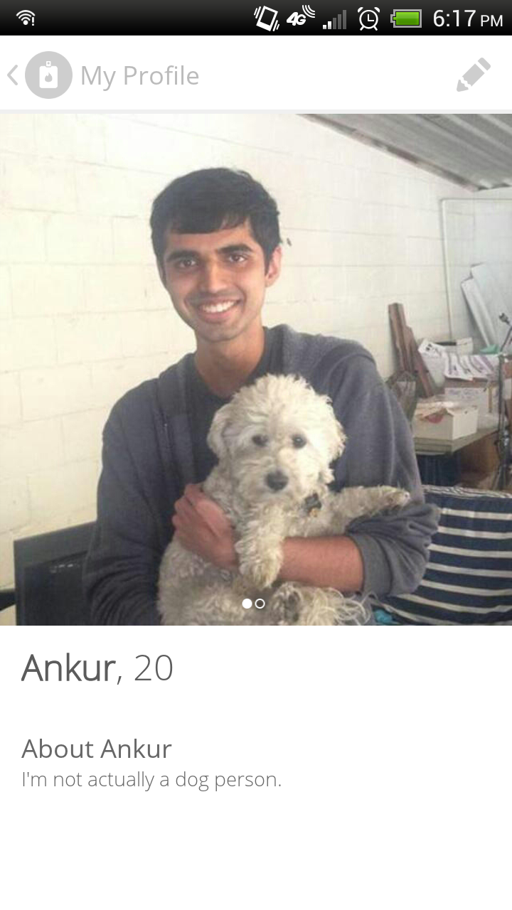
Images of our Tinder profiles. Aren’t we a couple of handsome devils?
Some time ago, two of our friends decided to conduct an experiment on Tinder. The friends, one male and one female, each swiped right on the next 100 profiles and recorded how many matches they got. Though our female friend received over 90 matches, the male garnered only one, giving a 90% match rate for the female and an abysmal 1% response rate for the male! The discrepancy we saw is not an isolated incident. This article from Godofstyle.com reports an experiment where male profiles at best garnered 7% match rates while a female profile received a 20% match rate.
Why such poor odds for men on Tinder? Women may be more discriminating with their swipes, but another possibility is that women are simply less active on Tinder. Pursuing the less depressing option, we set about trying to answer the following question: how does the activity rate of Tinder’s population affect a given user’s match rate?
p q r
Luckily for all us dateless men and women out there, the number of responses we get is not an accurate measure of your attractiveness on Tinder. Adapting Allen Downey’s work on “The Volunteer Problem,” a user’s total response rate p is the product of r, the true attractiveness rating, and q, the activity rating. For every 100 users we swipe, only some q fraction of them will even see our profiles, let alone swipe back. With that in mind, we have something to attribute our Tinder failures to: the inactivity of users who may not have logged in recently.
Still, it would be nice to know what our actual r response rate is. Finding p is simple --- simply measure the number of return swipes --- but we need to determine q to solve for r. With our set of Bayesian tools, Python scripts, and swiping fingers, we set out to estimate the activity rate, q, of other Tinder users.
How often do we Tinder?
For some of us, Tinder is a way of life. For a reasons we won’t get into here, we check Tinder hourly, keeping up to date with the latest swipes. But many users check the app more infrequently, going days or weeks without looking at new potential matches. Unfortunately Tinder’s best selling points also make life difficult for the amateur Bayesian statistician. The app provides minimal information on profiles and has no public history of past swipes and encounters. When seeing a new profile, the user’s last log-in time provides the only hint of her future activity, leaving us guessing if she chose to ignore our profile or simply never saw it.
Luckily, we can adapt Prof. Downey’s solution to “The Red Line Problem” to turn this sparse data into a predictive model. We start with an assumption that the average time between Tinder activity follows a normal distribution centered at 10 hours. Even then, someone who uses Tinder every 10 hours on average will occasionally check twice an hour or just once a week. We model this variance with an exponential distribution for each average activity period to show different activity rates for the same user.
(Note: all times and arrival rates are given in hours unless otherwise noted)
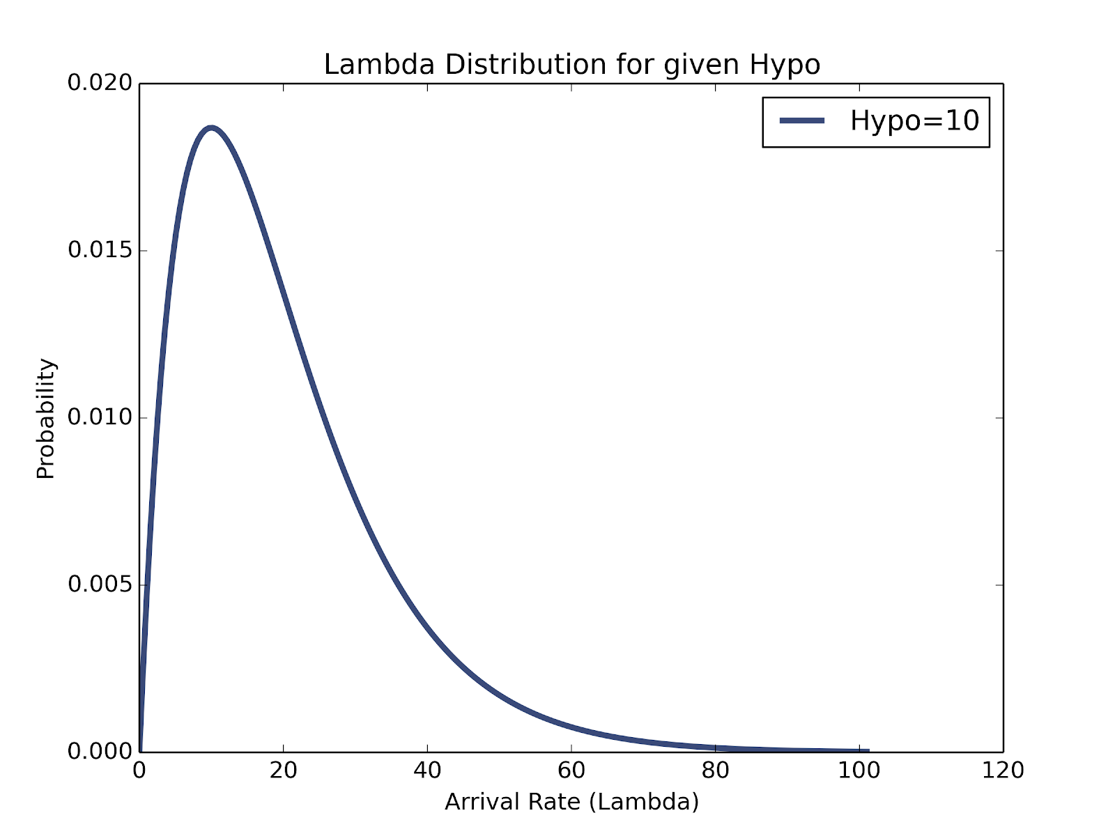
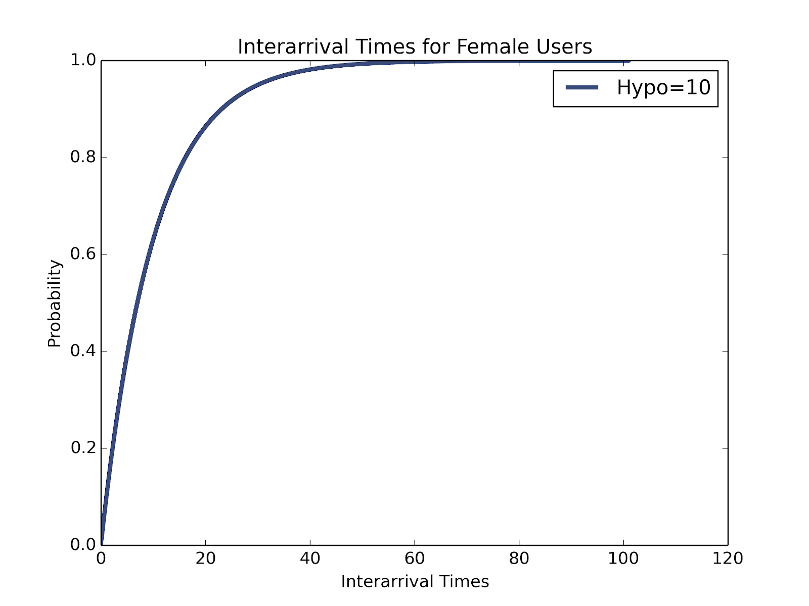
While some other user may go 10 hours without checking Tinder, our last arrival data only gives us a single point in that interval, skewing our results. First, we are 5 times more likely to observe someone during a 5 hour interval than a 1 hour interval, simply due to its length. We account for this bias towards larger intervals by multiplying each probability by time.
Exponential PDF scaled by time for for a user with an average of 10 hours between activity
Even with these likelihoods, our data comes in the form of time since last activity. 15 minutes ago could indicate a future log in 10 minutes or 10 days later, so we need to adapt our distribution to this type of input. For every gap between activity, we have an equal chance of making our observation at any point in between. Combining the chances of each activity period happening with the chances of finding a time in that period produces a mixture of various observed last log-in times, specific to each hypothetical user with a different average activity rate.
Exponential CDF for observed last activity time for a user with an average of 10 hours between activity
Now what?
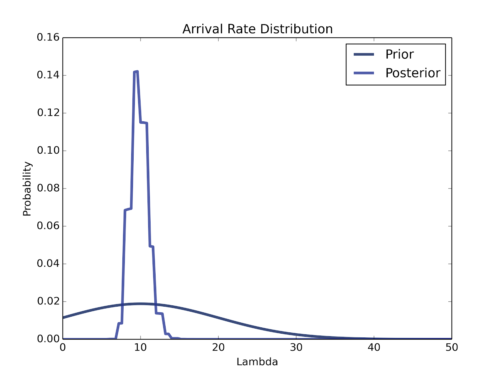
That was a lot of work to get to a distribution within a distribution within a distribution, but now we finally have a chance to use our data! Looking back at our prior distribution of average activity rates, we now have a corresponding distribution of observed past log-in times for each. We sampled 100 users to record their activity times, giving us accurate information for the users relevant to us. Our findings vary between genders, areas, and age ranges, so new time data must be collected for each aspiring Tinder statistician. Updating each of our hypotheses with the chance of observing the times we saw shows the graph below, a steep distribution centered at 10 hours.
Exponential PDF scaled by time for for a user with an average of 10 hours between activity
The posterior distribution peaks at the same central value as the prior, but with a smaller standard deviation, due the large amount of data. The small standard deviation likely indicates more about Tinder’s sorting algorithm than the true userbase, however. Given the number of people who have likely stopped using the app, we should see a much longer tail for users checking Tinder every 24 hours or longer. This data actually indicates that Tinder only shows us users that tend to be fairly active. This behavior makes sense: what dating app would match you with inactive users?
Predictive Modeling
After a bit of data collection and analysis, we now know the breakdown of our potential matches. Most of them check Tinder about every 10 hours on average, so they should respond promptly to our swipes. For the sake of modeling ease, let’s say that when someone checks Tinder, they instantly see our profile, regardless of the time they spend active or Tinder’s display algorithm. Not only does this make our analysis much easier, it also gives us a worst case estimate. If our results for Tinder success assume extra people see our profile, our true response rate can only be better.
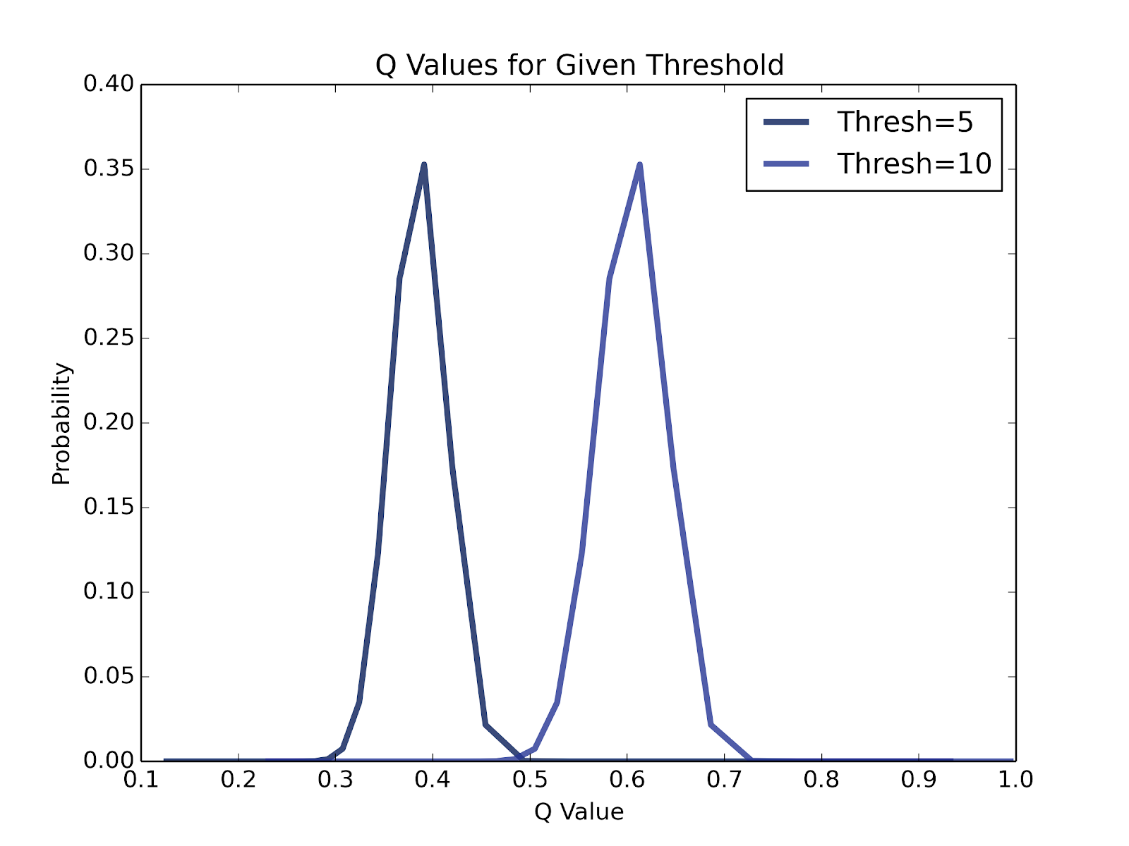
Using the spread of potential Tinder matches, we can predict how many will use Tinder within some threshold time. If we check again in 5 hours, for instance, we will of course receive fewer views than 10 hours later. To find the distributions of response rates, we looked at each average response rate, finding the chance of activity for that rate within some threshold time. Scaling all these probabilities by the likelihood of that average response rate produces a distribution of q, the portion of users active within some time.
q distributions for active users within 5 and 10 hours
True Response Rate
Now that we are able to generate a distribution for q, we are half way towards generating a distribution for a given user’s true response rate, r. Next, we need to know what the distribution of perceived response rate, p, looks like. Recalling that the product of q and r gives us p, we can reverse engineer our desired r distribution by taking the quotient of p over q! We’re working on that part of the problem now.
Conclusion
Clearly, we still have some work to do before we can say anything quantitative regarding a user’s true match rate, but we can say some positive things without going much further. One encouraging observation is that a user’s true match rate will always be better than the perceived match rate. While a user may see that only 10 out of every 100 profiles become matches, a percentage of those users have not even been on Tinder for quite some time. The upshot of this: you’re probably more attractive than Tinder makes you think you are!
That’s all for now. Happy swiping!